


Customize Layout

How to customize the default layout to your own design
Download customWebchatOptions and change the extention into .js.
This is a copy of defaultWebchatOptions.js file and allows users to overwrite the styles by adding the ones they want.
The file must be hosted on your server and included before the defaultWebchatOptions.js file, like a JS script:
<script src="{customerBaseURL}/customWebchatOptions.js"></script>Also, you can modify the file depending on how many facilities you want to give them. E.g. you can remove completely BotStyleOptions block meaning you will be able to change title and subtitle (text next to logo) and the look & feel for start and open buttons.
- BotStyleOptions contains style set options provided by Microsoft BotFramework-WebChat and must be updated following the instructions from official documentation https://docs.microsoft.com/bs-latn-ba/azure/bot-service/bot-builder-webchat-customization?view=azure-bot-service-4.0 , https://github.com/microsoft/BotFramework-WebChat/blob/0465cbff4e7b834accc079b056ed6d6ffd67bb1e/packages/component/src/Styles/defaultStyleOptions.js#L3
- LayoutOptions contains options for title, subtitle and look & feel of start and open buttons
Tips how to complete the file for few items:
- change title: uncomment title property and add the text wanted
- change start button: there are 2 ways to do that
- add an image: uncomment startWebchatImage property and add the absolute path of image
- add HTML code: uncomment startWebchatHtml property and add your HTML code
(if both are filled in the image has priority)
- change botAvatarImage: uncomment botAvatarImage property and add the absolute path of image
- add initials instead of avatar: set the following options
botAvatarBackgroundColor: '#colorCode' //e.g.#FF0000
botAvatarImage: '',
botAvatarInitials: 'AB', //only 2 letters- change look&feel for bubbleText: set the following options
bubbleFromUserBackground: '#BackgroundColorCode',
bubbleFromUserBorderRadius: 20,
bubbleFromUserTextColor: '#TextColorCode',
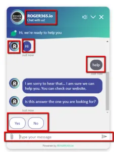
The image below shows which elements can be customized via customWebchatOptions.js file. All other components can be customized via CSS, for which you must write your own CSS files.
Customize Webchat Form
If you have added a pre Webchat form, you can also change the default layout. Underneath you’ll find the used CSS:
#wechatForm = preform
#webchatForm .message = headermessage
#webchatForm labels = input labels
#webchatForm Input = input veld
#webchatForm .button = send button

/* WebchatForm*/
#webchatForm {
    margin: 20px;
    border-radius: 15px;
    border: solid 1px grey;
    display: flex;
    flex-direction: column;
    background-color: rgb(240, 240, 240);
}

    #webchatForm .message {
        padding: 10px;
        margin-bottom: 5px;
        background: rgb(45,54,145);
        background: -moz-linear-gradient(135deg, rgba(45,54,145,1) 0%, rgba(77,214,176,1) 100%);
        background: -webkit-linear-gradient(135deg, rgba(45,54,145,1) 0%, rgba(77,214,176,1) 100%);
        background: linear-gradient(135deg, rgba(45,54,145,1) 0%, rgba(77,214,176,1) 100%);
        color: white;
        border-top-left-radius: 15px;
        border-top-right-radius: 15px;
        font-size: 14px;
    }

    #webchatForm .button {
        align-self: center;
        margin-top:auto;
        margin-bottom: 10px;
        font-size: 14px;
        padding: 6px 12px;
        color: white;
        display: inline-block;
        text-decoration: none;
        text-align: center;
        white-space: nowrap;
        vertical-align: middle;
        -ms-touch-action: manipulation;
        touch-action: manipulation;
        cursor: pointer;
        -webkit-user-select: none;
        -moz-user-select: none;
        -ms-user-select: none;
        user-select: none;
        background-image: none;
        border: 1px solid transparent;
        border-radius: 5px;
        background-color: #4dd6b0;
    }

    #webchatForm .formInput{
        margin: 0px 10px;
    }